Although the days of using physical paper maps are most likely behind most people and instead they favor GPS on their phones, it never does any harm to take a look at a good, old fashioned map. That is especially the case with the interesting and informative maps you are about to see. Whether you are a lover of geography or just looking for a new perspective on life and the world as you know it, this compilation of maps is bound to intrigue you and teach you something new.
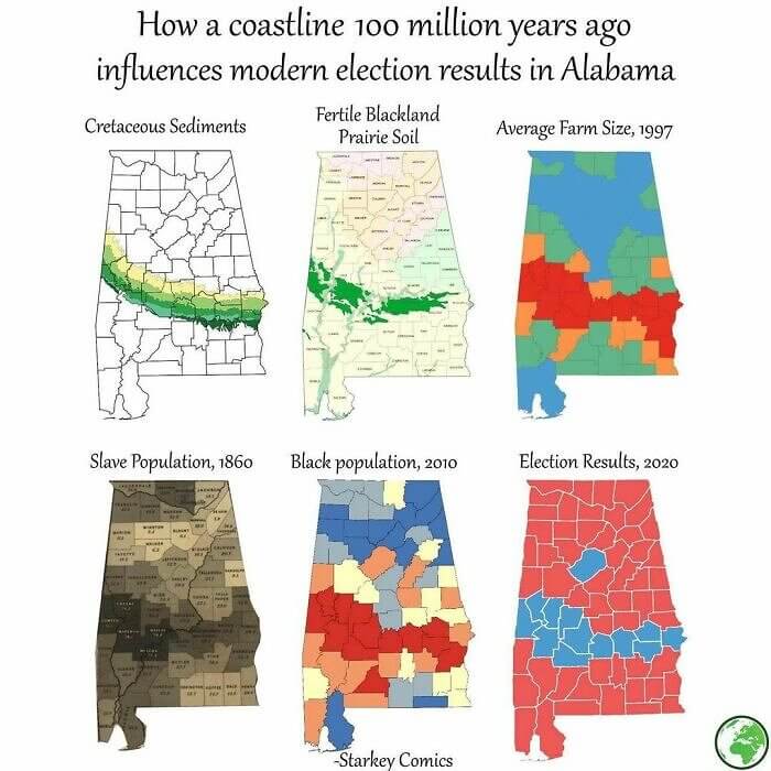
How a Random Coastline Can Change Election Results
This one might be a little difficult to understand if you don't actually look at the maps in depth. Even then, it seems a little far fetched. However, as you can see, it's actually pretty interesting. There was once a coastline in Georgie (100 million years ago) that resulted in fertile soil which resulted in different farm sizes which resulted in slave populations which resulted in larger black populations which resulted in a strip of land with different election results.
The majority of Georgia votes red, but this small portion of land in the middle with the higher African-American population causes it to be more blue.
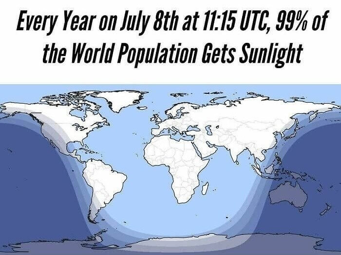
When Almost the Whole World Is Sunny
Each year there is a very unique and interesting event that happens on Earth. There is one time when 99% of the world's population sees the sun. This happens on July 8th at exactly 11:15 UTC. Who would have thought, right? Did you know that there was a time when the vast majority of the world was covered in bright sunlight and there was practically no darkness?
From the looks of it, mainly just Australia and Antarctica are left in the dark when the rest of the world is covered in sunlight. How must it feel to be the exceptions?
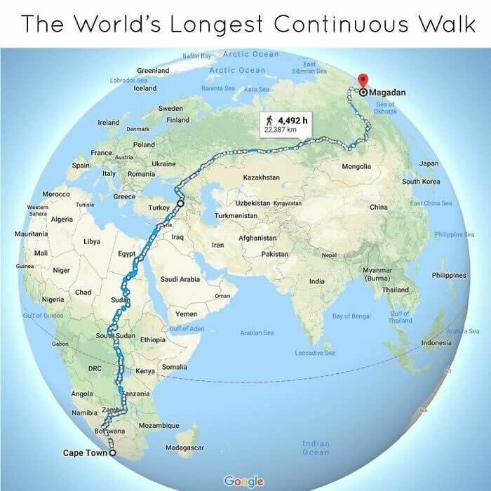
The Longest Walk in the World
Have you ever left your house and wanted to go on a nice long walk? Well, did you know that you could go on a very, very long walk if you wanted to...one that would take you halfway across the world. You can walk directly from Cape Town all the way through Africa, the Middle East, Asia, and Russia, taking you all the way to a town called Magadan in Russia.
This walk covers approximately 22,000 kilometers and would take a total of 4,500 hours if walked straight and consecutively the entire way (with no breaks at all).
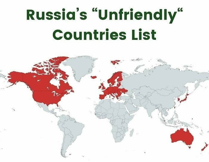
The Map of Countries Russia Hates
Have you ever wondered how much of the world is considered to be an enemy to Russia? Whether enemy or just not friends, this map shows you exactly what portion of the world it sees as unfriendly. Although it is not that much geographical space, it is most of the leading powers of the world including most of North America, Europe, and Australia. That is a lot of enemies to have!
It is interesting to see this in the map version. Most people know the main countries that Russia sees as problematic, but to see it on a map of the world makes things even more interesting.
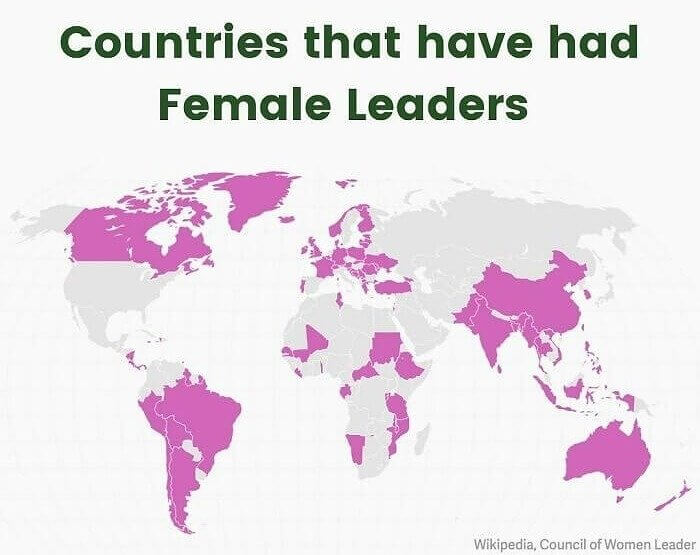
Female Leaders of the World
Have you ever stopped to think about how female leadership is divided among the world? Well, now is your chance to understand and appreciate it thanks to this map. This map has highlighted which countries have female leadership. Although it is not a huge amount, it also is not a small amount. Considering this would have been considered insane just a few decades ago, you can say the world has made some good strides.
Perhaps the most shocking part of this map is that the United States of America has not yet had female leadership in the form of a president. However, hopefully soon that will change!
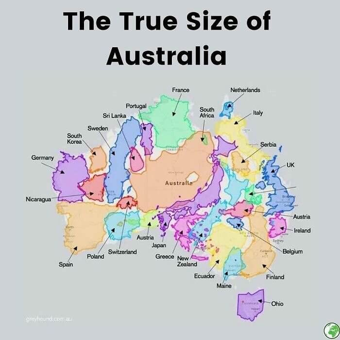
How Big Is Australia?
Although Australia sometimes gets forgotten about when it comes to world powers, at least according to its size, it really should not be! Just take a look at this map that shows how many European countries can fit in Australia. It seems like the whole of Europe and then some can fit in this one country that people sometimes forget about. There is a whole lot of unused land in Australia!
Maybe the reason some people don't see Australia as a very big country is that there is so much land that is uninhabitable. There are massive and vast open and empty spaces.
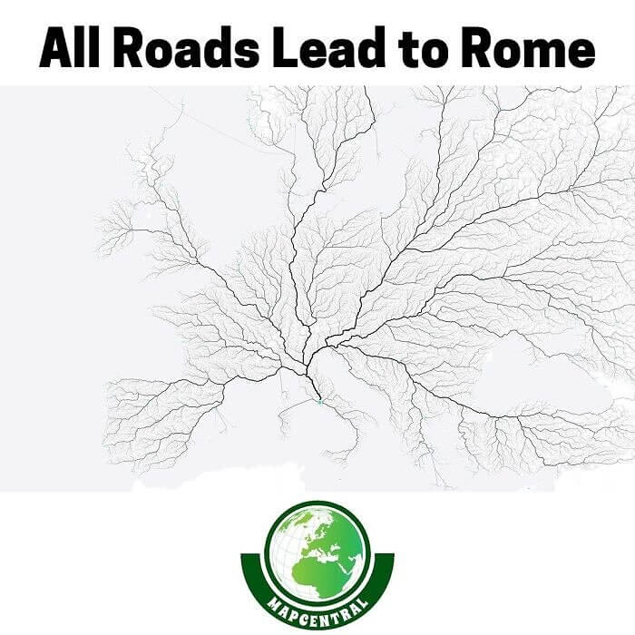
All Roads Lead to Rome
There is an age old saying that "all roads lead to Rome". Although you might have thought that it was just a random saying that had no actual meaning behind it, that is not the case. As you can see from this map, quite literally, all the roads do seem to lead to Rome. As Rome was the most important city of the Roman empire (hence the name), this would make sense!
It looks like a big family tree that is expanding out of Rome. All the roads lead to Rome and they all lead away from Rome at the same time.
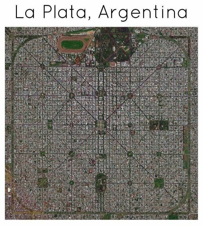
The Most Perfectly Designed City in the World
Have you ever wondered what it would look like to see a city that is perfectly designed? Well, this just might be your only chance. La Plata in Argentina is perhaps the most perfectly created place in the world. Just look at the streets. They are symmetrical and perfect in every way. If you look quickly, you would probably think that this is actually a drawing or a computer chip of some sort.
It must have been so satisfying to create this drawing and then to see it created and executed in such a perfect way. Just look at how everything lines up! It's perfection.
What the World Would Look Like if Sea Levels Rose
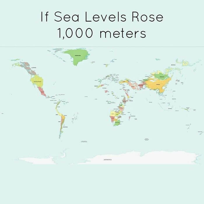
People are often talking about the risks and concerns of what would happen in sea levels rose too much. However, you probably have never seen what that would actually mean, especially in the visualization of a map. If the sea levels rose 1,000 meters, the world would look something like this. The continents would be so much smaller and the world wouldn't look much like the world everyone knows and loves.
In case you doubted the concerns that people have about the rising sea levels, now you can see why they have these concerns! The world would appear to shrink.
If Us Wealth Was Distributed
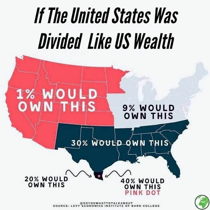
It's funny to think of how wealth is distributed among different populations of society. In the US, the distribution of wealth is displayed on this map, how it would actually be if things were divided among land. You can see how much land 1% of the population would control (compared to how much money 1% of the population in the US has). And then compare that to the 40% owned by the pink dot that is barely visible.
It's sort of scary to see the distribution of wealth displayed like this. It shows how uneven it is in the US, despite most people thinking it is a wealthy country.
Topographic Map of Germany
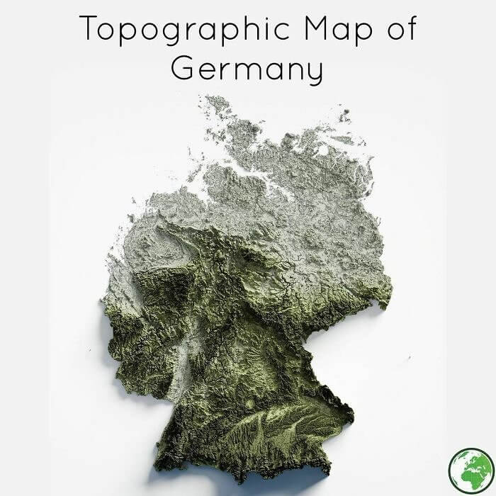
Usually, when people look at maps they see a very flat and simple version of what the country or the place is actually like. You are probably pretty used to seeing maps of Germany that include all the major cities and the roads, however, it is probably quite rare that you see a map that is topographic and shows the mountains and hills of the country like this one does.
Did you know that Germany was full of hills and mountains and greenage like this? You probably didn't know quite how much it was until you saw this map.
One Man Is Richer Than These Countries
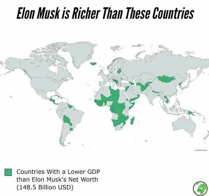
It's pretty crazy to think of how wealthy some people in the world are. It's also pretty crazy to think that there are some people who have more money than entire countries. Elon Musk is one of those people. He has more money than each of the countries highlighted on this map. That is a whole lot of wealth for one person to have. Imagine if he were to distribute it more.
It's crazy to think that if he chose to donate his money to one of these countries, he could make it a profitable and rich country.
Animals Around the World
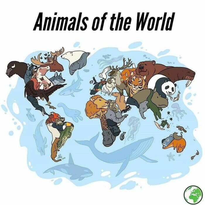
Just as people in different countries are not all the same, animals in different parts of the world vary as well. Each country has its own set of animals for which they are the most famous. For example, China is known for its pandas, North America for its bears and moose, and Africa for its lions, giraffes, and elephants. It's cool to see a map of the animals of the world.
There is of course a good amount of overlap with the animals in different geographical locations. They cannot be confined to just a country, but usually an entire region.
Levels of Democracy Around the World
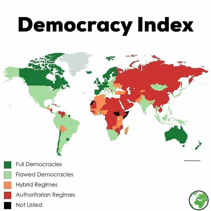
Have you ever thought to look at the world through the lens of how democratic are the countries? This map shows you each country of the world and just how democratic they are. There are only a few countries that are full democracies, while there are quite a few more that are flawed democracies, hybrid regimes, and a good amount that are authoritarian regimes. There does seem to be a lot of red on this map!
There are some countries that do not fall into any of these categories at all and are just labeled under "not listed". Maybe they are in the process of creating a government or maybe they are simply "none of the above".
Train System Set up Around the World
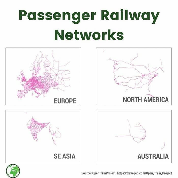
Looking at the world through the lens of railways in the country is a very unique and different perspective to give on the situation. You may never have thought about how different the train set up is in Europe compared to North America or Australia. However, from the looks of these maps, it is actually quite different indeed. Europe seems to be set up pretty well in terms of trains, along with South East Asia.
This is probably the reason that everyone in the US and Canada needs to have a car. What else can you do when the train system in your country is so poor?
Election Results in North Korea
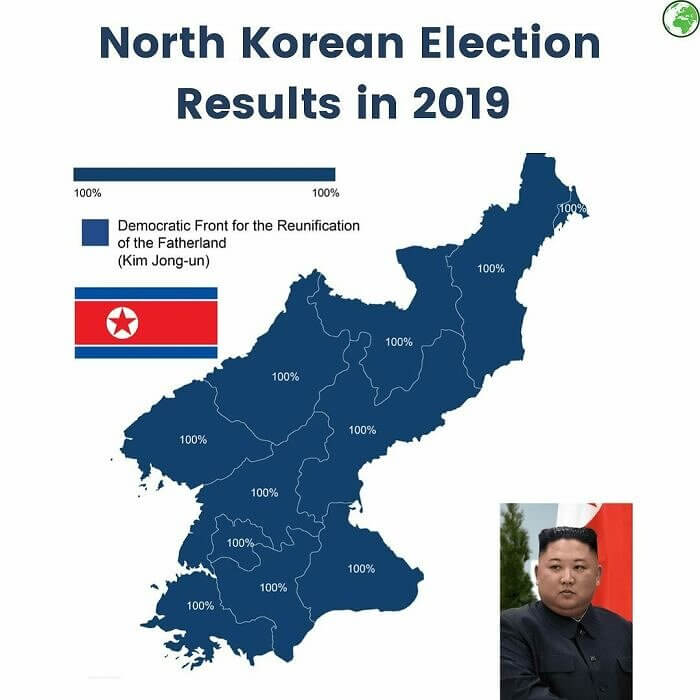
Have you ever wondered what the election results looked like in North Korea? Well, this map gives you the full, straightforward picture. It looks like the whole country is painted in blue. It must be a nice feeling to see that literally everyone in the entire country that was able to vote voted for you. It must take a special kind of delusion to think that is true (and comes from a good place).
100% of the people probably did actually vote like this in the 2019 elections in North Korea, however, they knew that they couldn't vote any other way and still survive.
The Dutch Are Really Building up Their Country
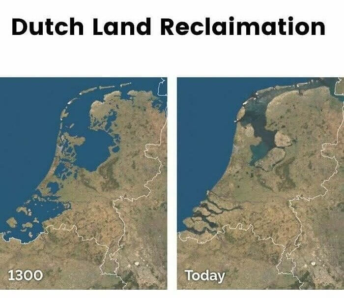
Who would have thought that a country could change so much in a few thousand years, and for the better? Of course, infrastructure and the like would easily change, however, you probably didn't think that the land mass itself of a country would change. However, that is exactly what happened in the Netherlands. You can see on this map the difference in the shape of the country from the 1300s to today.
The real question now is how did they manage to do that? It seems like it is going against everything that would happen naturally in the world.
Who Has Youtube Around the World?
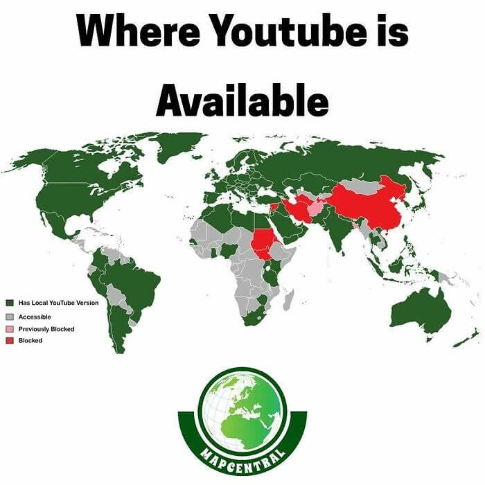
You probably never thought to look at the world in the sense of who has access to YouTube, however, now is your chance to do just that by looking at this map here. You can see who has access to YouTube, where it was previously blocked, and where is it completely blocked. There are only a few countries in the world that have blocked it entirely and officially and they are highlighted in red.
It's crazy to think that YouTube has spread all around the world like this. You can sit in our home and watch a video at the same time as someone halfway across the world.
If New York City's Population Was Spread Out
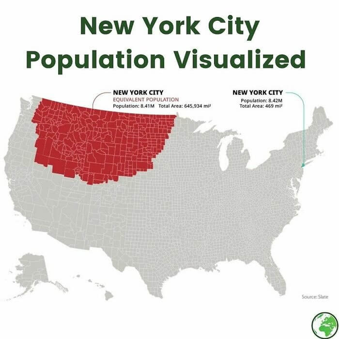
It might be hard for you to visualize and understand just how densely populated the city of New York is. That tiny little green dot on the map (which is hardly visible), has the same population as the entire area that is highlighted in red. 8.42 million people are in both of those spaces. One is a total of 469 square miles and the other is a total of 645,934 square miles.
When you look at this, it's hard to understand how that many people are able to fit in such a small space in New York City. How is it even possible?
The Saddest Place to Live
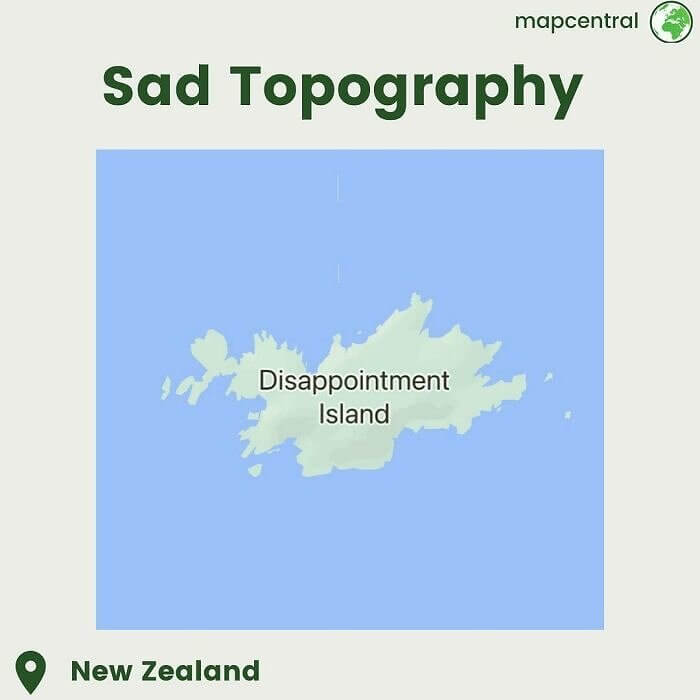
It's hard to imagine that there is an island on earth that is known as Disappointment Island. It must be a pretty depressing place to live if anyone even lives there. What makes it so disappointing though? Islands are usually one of the favorite and most loved places on earth. Is it an island with no beaches? Or is it an island that is always cold? Or is it uninhabitable?
Maybe this shouldn't be the top place for you to put on your bucket list when you are going to New Zealand. You might just be left feeling a little disappointed after your visit.
They Are All Actually One Mountain Range
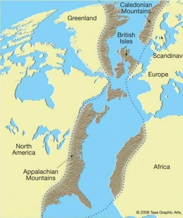
Who would have thought that there are multiple mountain ranges around the world that were actually once connected as one big mountain range? The Scottish Highlands, the Appalachians, and the Atlas Mountains were actually all once the same mountain range known as the Central Pangean Mountains. It's pretty crazy to think of now considering that they are all halfway around the world. It seems impossible to think that they were all once connected and the same.
These mountain ranges have certainly adapted to the different temperatures in their locations over the years. They hardly look alike at all known, hence why no one would think that they are the same.
The Shark That Swims in the Shape of a Shark
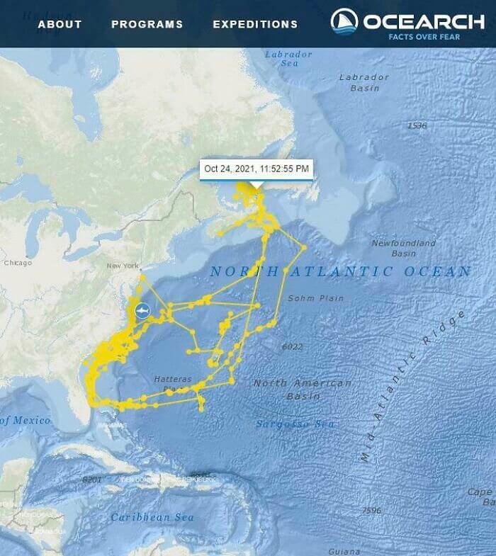
A group of scientists put a GPS tracking device on a shark and then tracked his movements in the ocean over the course of a few weeks. When they looked at the overall route that he chose to take in these weeks where he was being tracked, they were quite surprised to find that he swam in the shape of none other than...a shark. Is it coincidence or was it intentional?
This almost seems too incredible to be a coincidence. However, if it was intentional on the side of the shark, it has opened a whole slew of other questions that have no rational answer.
A Pretty Accurate Freestyle Map Drawing
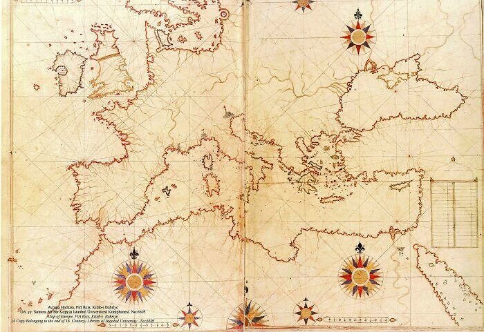
Although this map might not seem that impressive when you look at the detailed maps that are available today, when you consider that this map was drawn by hand by a cartographer in 1513, you will probably change your perspective. This Turkish sailor and cartographer certainly did not get everything right, but considering the technology that was available at the time, it is pretty impressive that he was able to create such an accurate map.
If he was sailing all through the waters of these areas, he would know the areas better than most, but that is still impressive to create just from memory.
How Far Will an Arctic Fox Travel
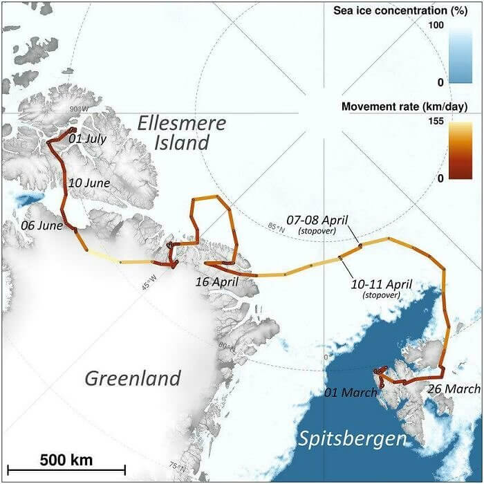
You might not think that an animal as small as an arctic fox would do much traveling around. You probably expect them to stay in their small areas and not leave for far distances. However, as is shown in this map, that is very much not the case. They tracked an arctic fox in 2018 on his journey from Norway to Canada. That is not a small journey, to say the least.
The only thing missing from this map is understanding how long it too the fox to make this journey. Did he do it in a few days, a few weeks, or across a whole season?
Africa Compared to the Rest of the World
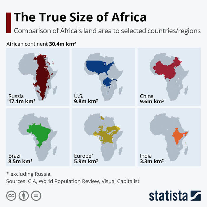
Many people around the world underestimate the size of the African continent. When you look at a map of the world, it doesn't appear to be that much larger than some of the other continents or compared to other countries, however, it is quite a large piece of land. On this infographic, you can see the real size of the continent of Africa when compared to Europe, Russia, the US, China, India, and Brazil.
Perhaps the most shocking one here is the size of Russia compared to the size of Africa. Russia is known to be a massive place, but who thought it would be smaller than Africa?
What Mexico Used to Look Like
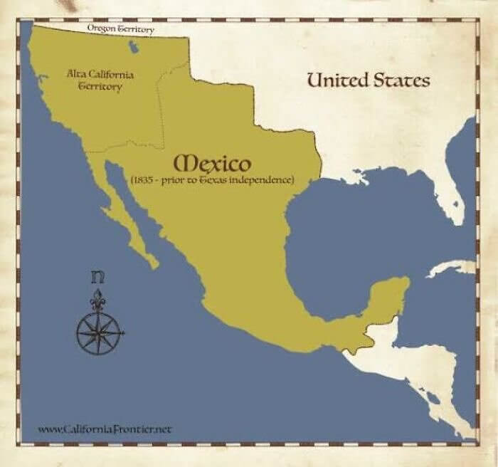
Did you know that Mexia, around the year of 1835, was actually significantly larger than the Mexico that people know and love nowadays? It extended very far into US territory and practically cut the size of the US in half. Most people aren't used to seeing maps of North America looking like this. After all, this is how it looked almost 200 years ago, so quite a lot of time has passed since.
From the looks of it, everything changed when Yexas had independence in 1835. And the borders became a lot closer to the borders the world is familiar with today for the US and Mexico.
Cyprus in the 1500s Versus Today
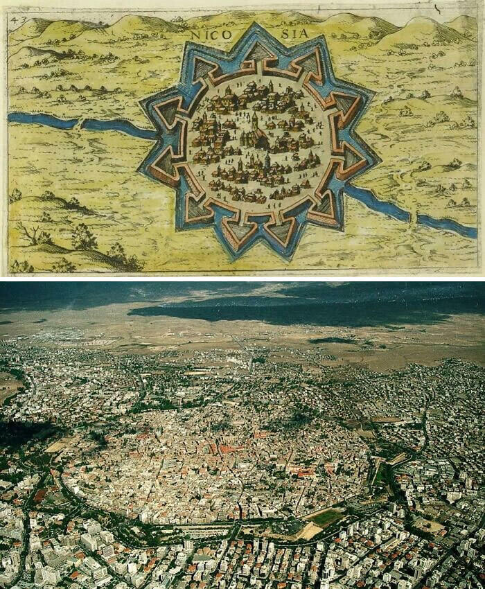
It's pretty crazy to see maps that were drawn and created in the 16th century that look so similar to the fancy, drone footage of maps that are available today. Here you can see a drawing of a map of Nicosia in Cyrprus from the 1500s. You see the distinct star shape and the city that is within. Then you can see the same thing is the real life version from the present.
You can still see the star shape and the city within, even thousands of years later. It's pretty remarkable to say the least. Time flies, but it doesn't change that much.
Where Are You From Map
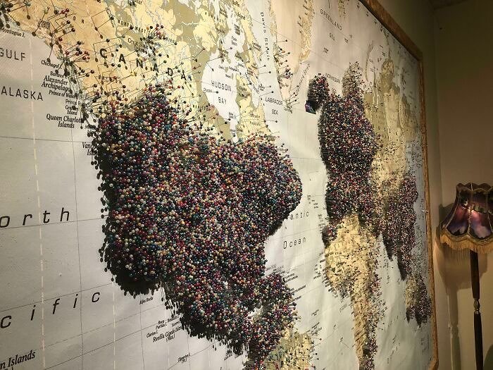
It seems like, from the looks of this map, that Reykjavík Iceland is a pretty popular tourist destination, for people from all around the world. The Aurora Museum created this map for tourists to use to show where they came from in the world. You can see just about every country represented and so many from North America, Europe, and Asia. The pins and marks from the US tourists is particularly strong.
You can also see how general tourism is distributed among different populations and countries around the world. You can see how privileged certain populations are to be able to travel compared to others.
A Map From Fairyland
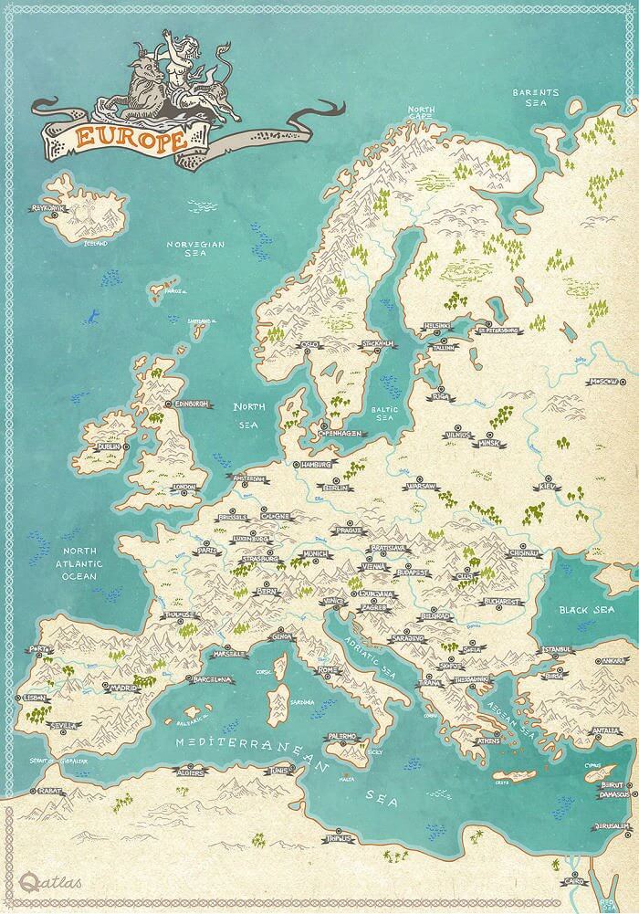
Have you ever dreamed of having a map like the one they use in fairy tales? Although you know it's not the most accurate, there is something about the quaint drawing and handmade aspects of this that make it very appealing. It is a piece of artwork and also a map at the same time. Who wouldn't want to hang this up in their room and also use it to map out a fairy journey with their friends?
Because it is hand drawn, obviously it is not the most accurate map. However, you do manage to get the general idea and geography of the place.
A Globe for the Blind
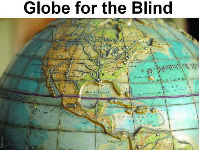
Luckily the world is in a time where they have made accessible things for all different types of people. This is one such example where they have made a globe for the blind. It has raised borders and brail engraving so they can read it and feel what the earth looks like. It must be a pretty cool experience for them to feel the world even if they cannot see it.
People who are not blind would also benefit from utilizing this map sometimes. It would give them a different perspective on things and the world in general.
States Where It's Legal to Get Evicted for Being Gay
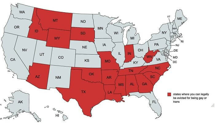
You might not think it is real that there are some states in the US that still have practically no gay rights in place. The states highlighted in red on this map have laws in place that make it completely legal for a landlord to evict a tenant just because they are gay or transgender. And yes, this is a current map, not one from the 1970s or the 1990s.
It's pretty crazy to think that this is still legal in so many places in the US. You tend to think that only dictatorships or religiously-ruled countries have such laws.
How the Japanese See Europe
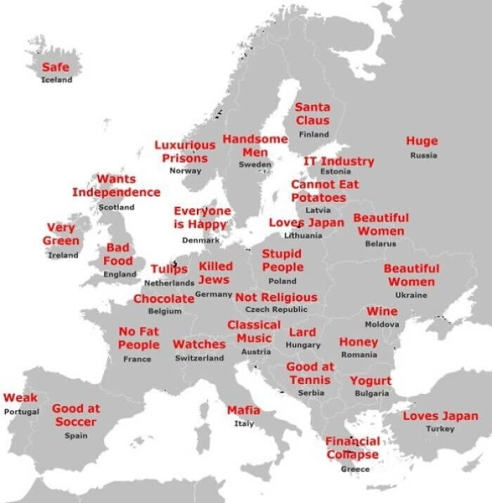
It's easy to stereotype places, especially if you have never been to them. After all, you can't remember everything about every place that you know of in the world. It's easier to just give them one or two things that they are famous for and go with that. In this map, you can see the main things that these countries are known for, at leat in the eyes of the Japanese.
Some of them are pretty obvious like Italy and the mafia, but why is Hungary known or lard and Latvia as a place that cannot eat potatoes? Where did they get some of these ideas?
Is There an Algeria in Space as Well?
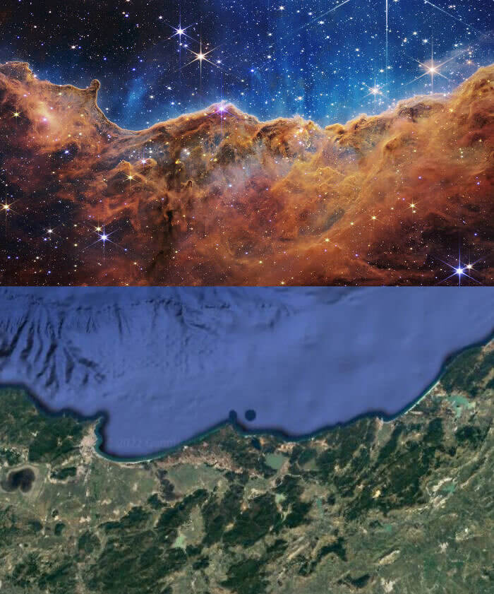
Now this one is actually a bit freaky and scary at the same time. It is a new level type of coincidence that does not leave people with many answers. The Carina Nebula from James Webb Space Telescope captured this image from space. At first glance, it doesn't appear to be too shocking, but then you see that it matches the Eastern coast of Algeria almost exactly...freaky to say the least.
This was trending in Algeria for a while and for good reason. Who wouldn't be shocked and in awe from seeing something like this? It leaves so many unanswered questions.
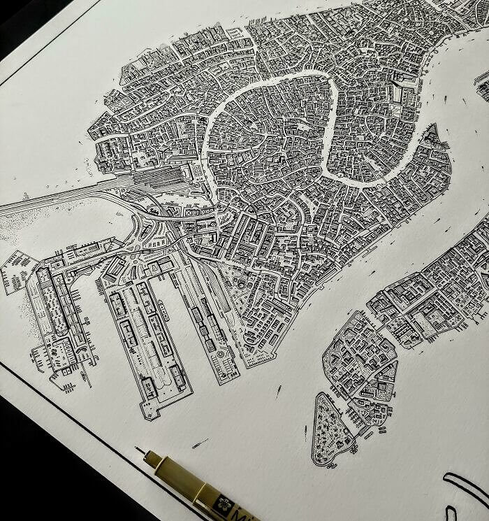
The Most Beautiful Hand Drawn Map of Italy
In case you were under the impression that this was a real map and not a hand drawn version of a map of Italy, you would be mistaken. If you take a closer look you can see that this is all hand drawn with a pen. All of the individual lines and dots and the utter and complete perfection of this are quite shocking. How long did it take to make this?
It must have been pretty satisfying to complete this map in the end. It is so beautiful and perfect, it is truly a piece of art that should be hung up and put on display.
The Social Progress Index Compared to the US
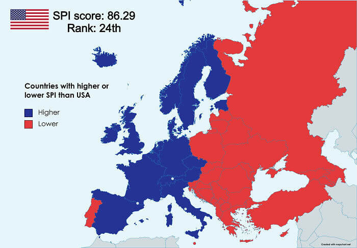
It is interesting to compare different countries of the world by the social progress index, especially when you are comparing the US and European countries. If you are from Europe, you know how much you like to brag about your social progression compared to the US, but this map tells the true story and shows how it is divided. The division is quite clear between eastern and western Europe and the US.
The only exception seems to be Portugal which is highlighted in red on the side. They are less socially progressed than the US according to this index and ranking system.
Is It a Lake or Is It Ice?
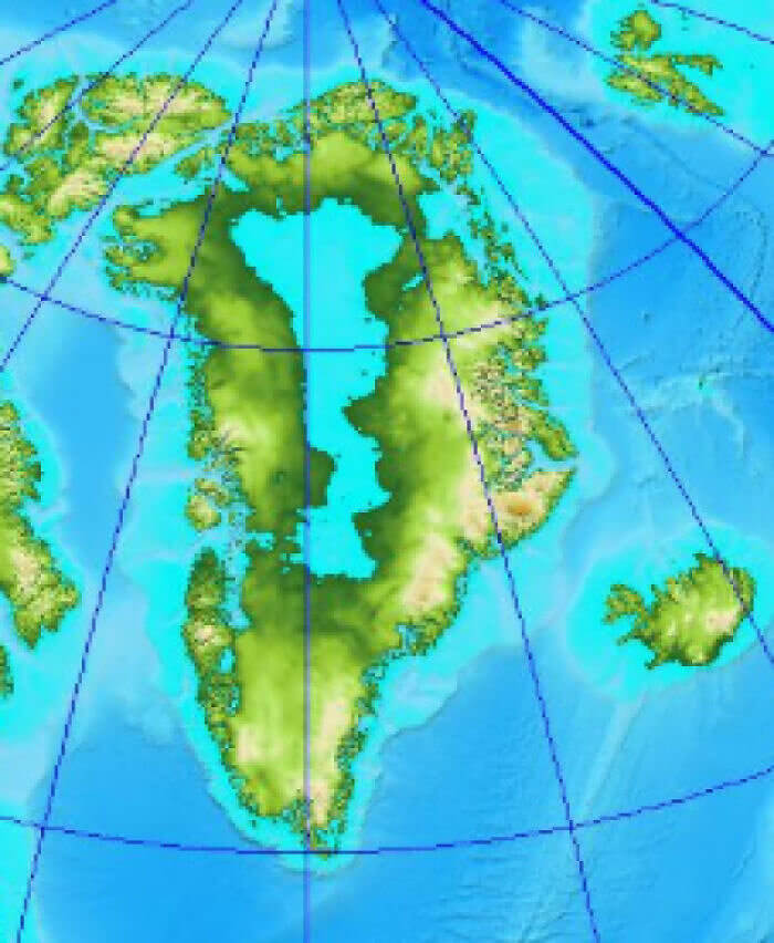
It's pretty ironic when you learn that although Greenland is called Greenland, it is mostly filled with ice and has very little green in the country. On the contrary, Iceland, although it is cold, is pretty green and does not contain that much ice. But getting back to Greenland, as you can see on this map, most of the country is actually a big ice lake. If you were to melt the ice, you would have a huge lake in the middle of Greeland.
Fun fact is that Greenland was given its name by an explorer who was hoping to trick people into settling in the land by the appeal of its name.
The British Showing the World How to Queue
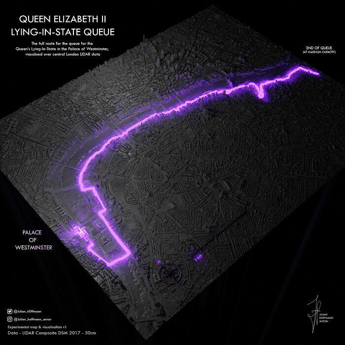
If there is one thing that the British are famous for, possibly even more than tea, it's their ability to queue. Always polite and waiting their turn they have shown their true colors on this map as well. This is the queue for the Queen Elizabeth II Lying in state. It is highlighted in purple, but you can see that there are no people who can queue quite like the British.
This also shows how incredible of a Queen she was, that there are this many people in the country waiting in line to get a glimpse of her.
They Did Not Receive an Invite to the Funeral
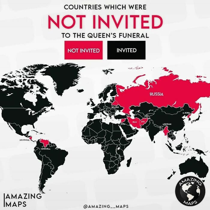
If you want to see what some of the least liked countries are in the world, this is perhaps the easiest way to do so. The countries highlighted in red on this map did not receive an invitation to attend the funeral of Queen Elizabeth II. As you can see, the majority of the world's countries did receive an invite, however, there were some major exceptions like Russia and Iran.
It's pretty obvious why these countries were not invited to the funeral and there is no way this could have come as any shock to them when the invites went out.
Countries That Believe in God
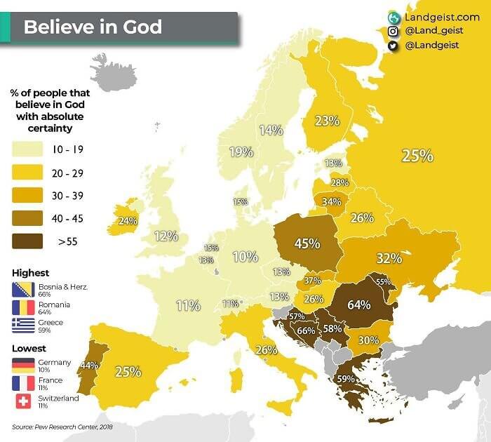
It is no secret that the majority of the western world is slowly but surely becoming less and less religious. They are quickly losing their belief in God. And you can see how much in this map here. Bosnia, Romania, and Greece seem to have the highest percentage of people who still believe in God, while Germany, France, and Switzerland have the lowest percentage of people. who believe in God.
This map would probably look very different if it was in different parts of the world. Asia and South America might have a very different story to tell than Europe.
A Map of Mexico Carved Into the Wall
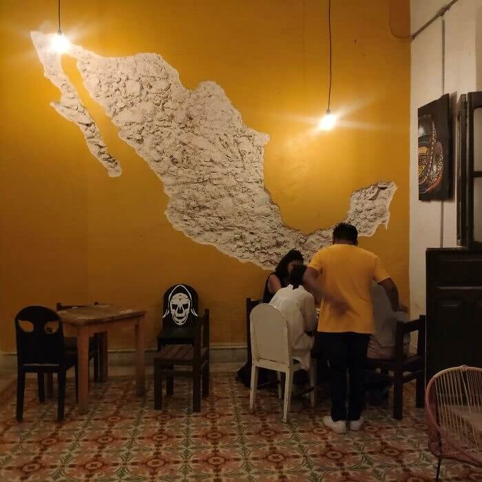
This bar in Yucatan decided to get creative with its decor and decorations in their bar. Instead of getting a map to hang on the wall, they carved one out of the wall. It makes for a cool look and also shows how proud they are of their country. It's a nice thing to keep in mind if you want to decorate for very inexpensive...just carve into the wall.
It looks like yellow is also the theme here if you are judging by the wall and the map standing in the yellow shirt.

